# 第二章:动手自己写一个Android应用
我们开始手写一个个小的示例,来体会每个控件的实际用途
以下是我们要掌握的Android基础的大纲:
线性布局和相对布局、表格布局
TextView文本控件及其属性
EditText可输入文本框控件及其属性
边框及背景设置
页面上的第二个布局创建及使用
Button按钮控件及其属性
掌握上面的6个知识点就可以做出一个基础的本地APP了,后续需要数据支持的话可以申请网络上的开放API接口或者自己数据库的信息进行进一步的个性化数据展示等
注意:下面代码区相同属性注释不再重复标注
# 2.1 布局管理器
# 2.1.1 布局的基本认识
我们第一个来认识的就是布局管理器Layout布局文件activity_main.xml,主要用于展示Android项目的界面,毕竟长得好看才是喜欢的前提(√)
最常用的简单布局就是线性布局和相对布局,这里我们以相对较简单的线性布局LinearLayout示例
打开activity_main.xml文件,里面存放着的就是你的启动首页的布局代码:
<?xml version="1.0" encoding="utf-8"?>
<androidx.constraintlayout.widget.ConstraintLayout
    xmlns:android="http://schemas.android.com/apk/res/android"
    xmlns:tools="http://schemas.android.com/tools"
    xmlns:app="http://schemas.android.com/apk/res-auto"
    android:layout_width="match_parent"
    android:layout_height="match_parent"
    tools:context=".MainActivity">
    <TextView
      android:layout_width="wrap_content"
      android:layout_height="wrap_content"
      android:text="Hello World!"
      app:layout_constraintBottom_toBottomOf="parent"
      app:layout_constraintLeft_toLeftOf="parent"
      app:layout_constraintRight_toRightOf="parent"
      app:layout_constraintTop_toTopOf="parent" />

  </androidx.constraintlayout.widget.ConstraintLayout>
2
3
4
5
6
7
8
9
10
11
12
13
14
15
16
17
18
看起来很多对吧,其实我们完全可以把以上代码删去,使用下面的代码**(仔细看上下区别)**
<?xml version="1.0" encoding="utf-8"?>
<LinearLayout
1 xmlns:android="http://schemas.android.com/apk/res/android"
2 xmlns:app="http://schemas.android.com/apk/res-auto"
3 xmlns:tools="http://schemas.android.com/tools"
    android:layout_width="match_parent"
    android:layout_height="match_parent"
4 tools:context=".MainActivity">

</LinearLayout>
2
3
4
5
6
7
8
9
10
这样就完成了对初始布局的修改,除了以上1,2,3,4行系统自动生成的暂时不需要管以外,android: layout_width和android: layout_height是布局的宽高属性,后面的match_parent是属性的属性值
还有比如这里的 这种标签,而这里则是将标签换成了 有了上面这样的理解后你就差不多了解Android布局了,剩下只要知道属性就可以试着画出一个界面了 接下来我们讲讲最常用的线性布局 线性布局,可以理解成在一条线上进行布局(hhh神奇的比喻) 也就是说这个布局只能提前设定组件的摆放方向**(orientation属性)**, 是横着摆?("horizontal") 还是竖着摆?("vertical") 这就是第一个线性布局的属性 android: orientation= "horizontal" or "vertical" 注意:horizontal和vertical只能选一个,且只能应用给当前线性布局,默认代码是没有这个属性的,不写这个属性它默认是横着摆("horizontal") 布局当然还有常见的宽度(width)和高度(height),这里只有两个属性值: wrap_content:表示和自身内容一样的大小 和 match_parent:表示和父组件一样的大小。 可以简单理解成:wrap_content是里面的控件占多大地方他就多大,match_parent是和父组件一样大小,父组件比如说是整个手机屏幕,他就是整个手机屏幕大小 以下是横向和纵向的示例代码: 横向图示:
纵向图示:
相对布局,顾名思义,需要一个控件(比如TextView)作为参考,设置在这个空间的上下左右方向,所以它里面的控件需要有一个必要属性,就是与哪个组件的相对位置,下面是示例代码 : 大概就是长下面这样: 这个就更简单了,学过前端的同学应该都知道,H5语法有这样的表格语法: 其中tr代表行,td代表列,在浏览器显示如下: 同样的,Android布局也遵循这样的代码编写格式: 发现什么了没 TableLayout可以理解为Html的table标签,TableRow就是tr,这里td设备无需设置的,至于要显示几个,完全就是看你控件放了几个,例如一行放三个我可以写为: 好了,常用的布局就介绍的差不多了,下面介绍下布局的通用属性有哪些,当然,也会介绍一些布局的专用属性 从这里我们就开始酱一些常用的和一些布局独有的属性了。首先明确,不可能只有这些常用的属性,还有一些是特定场景中与要用到的,由于我们是入门所以不需要对特定场景进行分类,所以以上算是必学的属性,学不会的快爪巴(滑稽) 控件和布局的基础两大属性,放在一起说了 这个属性除了和H5的能设置具体的控件尺寸外,还可以使用"wrap_content"、"fill_parent"和"match_parent"这三种“状态” 第一种"wrap_content":表示大小正好能显示控件中的内容 比如下面这种: 差不多就是这样 第二种"fill_parent":设置布局/控件为fill_parent将强制性让它布满整个屏幕或填满父控件的空白 Android中fill_parent和match_parent(从Android2.2)是一样的。 为了兼容低版本,建议使用fill_parent 差不多就是这样 这个也算是页面设计中比较常用的属性了,margin外边距,padding内边距,如果直接使用的的话会出现以下情况:# 2.1.2 线性布局LinearLayout 的属性详解
横向排列horizontal
<LinearLayout
    android:layout_width="match_parent"
    android:layout_height="match_parent"
    android:orientation="horizontal"----->这里就是改变布局的属性
    tools:context=".MainActivity">
 </LinearLayout>
2
3
4
5
6
7组件1 组件2
纵向排列vertical
<LinearLayout
    android:layout_width="match_parent"
    android:layout_height="match_parent"
    android:orientation="vertical"------>这里就是改变布局的属性
    tools:context=".MainActivity">
 </LinearLayout>
2
3
4
5
6
7组件1 组件2 # 2.1.3 相对布局RelativeLayout
< RelativeLayout
   android:layout_width="match_parent"
   android:layout_height="match_parent"
   tools:context=".MainActivity">
	   />
<!-- 这个是在容器中央的Youtube图标(红色) -->
    <ImageView
        android:id="@+id/img1"
        android:layout_width="80dp"
        android:layout_height="80dp"
        android:layout_centerInParent="true"
        android:src="@drawable/pic1"/>
    <!-- 在上面Youtube图标的左边的Github图标 -->
    <ImageView
        android:id="@+id/img2"
        android:layout_width="80dp"
        android:layout_height="80dp"
        android:layout_toLeftOf="@id/img1"   <!—表示在id为img1的图片控件左边-->
        android:layout_centerVertical="true"
        android:src="@drawable/pic2"/>
<!-- 在Youtube图标右边的谷歌云端硬盘 -->
    <ImageView
        android:id="@+id/img3"
        android:layout_width="80dp"
        android:layout_height="80dp"
        android:layout_toRightOf="@id/img1"  <!—表示在id为img1的图片控件右边-->
        android:layout_centerVertical="true"
        android:src="@drawable/pic3"/>
</ RelativeLayout>
2
3
4
5
6
7
8
9
10
11
12
13
14
15
16
17
18
19
20
21
22
23
24
25
26
27
28
29
30android:layout_centerInParent="true" 表示在相对布局里的控件都在一行的中央位置
#### 2.1.4 表格布局TableLayout
Github图标 Youtube图标 Google云盘图标 <table border="1">
<tr>
<td>row 1, cell 1</td>
<td>row 1, cell 2</td>
</tr>
<tr>
<td>row 2, cell 1</td>
<td>row 2, cell 2</td>
</tr>
</table>
2
3
4
5
6
7
8
9
10row 1, cell 1 row 1, cell 2 row 2, cell 1 row 2, cell 2 <TableLayout
android:id="@+id/TableLayout2"
android:layout_width="fill_parent"
android:layout_height="wrap_content">
<TableRow>
<Button
android:layout_width="wrap_content"
android:layout_height="wrap_content"
android:text="row 1, cell 1" />
<Button
android:layout_width="wrap_content"
android:layout_height="wrap_content"
android:text="row 1, cell 2" />
</TableRow>
<TableRow>
<Button
android:layout_width="wrap_content"
android:layout_height="wrap_content"
android:text="row 2, cell 1" />
<Button
android:layout_width="wrap_content"
android:layout_height="wrap_content"
android:text="row 2, cell 2" />
</TableRow>
</TableLayout>
2
3
4
5
6
7
8
9
10
11
12
13
14
15
16
17
18
19
20
21
22
23
24
25<TableLayout
android:id="@+id/TableLayout2"
android:layout_width="fill_parent"
android:layout_height="wrap_content">
<TableRow>
<Button
android:layout_width="wrap_content"
android:layout_height="wrap_content"
android:text="row 1, cell 1" />
<Button
android:layout_width="wrap_content"
android:layout_height="wrap_content"
android:text="row 1, cell 2" />
<Button
android:layout_width="wrap_content"
android:layout_height="wrap_content"
android:text="row 1, cell 3" />
</TableRow>
</TableLayout>
2
3
4
5
6
7
8
9
10
11
12
13
14
15
16
17
18
19
20# 2.2 常用布局属性
# 2.2.1 android: layout_width和android: layout_height
<Button
        android:id="@+id/button1"
        android:layout_width="wrap_content"
        android:layout_height="wrap_content"
        android:text="传递数据" />
2
3
4
5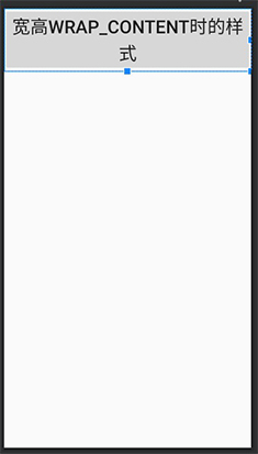
  <Button
        android:id="@+id/button1"
        android:layout_width="fill_parent"
        android:layout_height="fill_parent"
        android:text="传递数据" />
2
3
4
5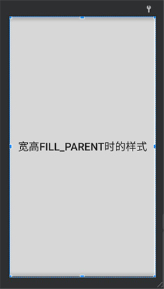
# 2.2.2 layout_margin+方位/padding+ 方位
# 2.2.3 gravity